pandas.Series.plot.line#
- Series.plot.line(x=None, y=None, **kwargs)[源代码]#
将 Series 或 DataFrame 绘制成线图。
此函数可用于使用 DataFrame 的值作为坐标绘制线图。
- Parameters:
- x标签或位置,可选。
允许将一列绘制到另一列。如果未指定,则使用 DataFrame 的索引。
- y标签或位置,可选。
允许将一列绘制到另一列。如果未指定,则使用所有数字列。
- colorstr, array-like, or dict, optional
DataFrame 列的颜色。可能的值包括:
- 按名称、RGB 或 RGBA 代码引用的单个颜色字符串,
例如 ‘red’ 或 ‘#a98d19’。
- 按名称、RGB 或 RGBA 引用的颜色字符串序列
code,将递归用于每一列。例如,[‘green’,’yellow’] 会依次为每一列的线条填充绿色或黄色。如果只有一列需要绘制,则仅使用颜色列表中的第一种颜色。
- 形式为 {列名颜色} 的字典,以便每列将
相应地着色。例如,如果你的列名为 a 和 b,则传递 {‘a’: ‘green’, ‘b’: ‘red’} 会将列 a 的线条着色为绿色,将列 b 的线条着色为红色。
- **kwargs
附加关键字参数在
DataFrame.plot()中有详细说明。
- Returns:
- matplotlib.axes.Axes 或它们的 np.ndarray
当
subplots=True时,将返回一个 ndarray,其中每列有一个matplotlib.axes.Axes。
参见
matplotlib.pyplot.plot将 y 相对于 x 绘制成线和/或标记。
Examples
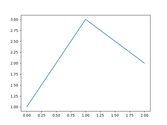
>>> s = pd.Series([1, 3, 2])
>>> s.plot.line()
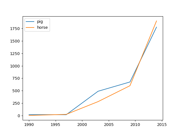
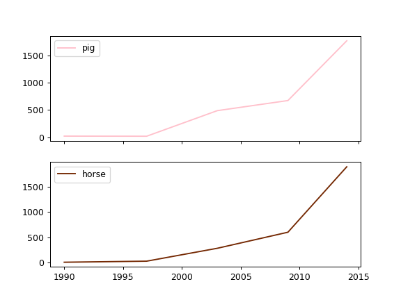
以下示例显示了几年间一些动物的数量。
>>> df = pd.DataFrame({
...    'pig': [20, 18, 489, 675, 1776],
...    'horse': [4, 25, 281, 600, 1900]
...    }, index=[1990, 1997, 2003, 2009, 2014])
>>> lines = df.plot.line()
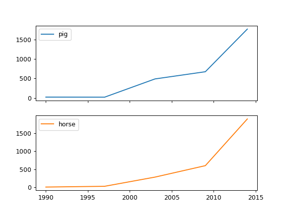
一个带有子图的示例,因此会返回一个轴数组。
>>> axes = df.plot.line(subplots=True)
>>> type(axes)
<class 'numpy.ndarray'>
让我们重复同样的例子,但要为每一列(本例中是每种动物)指定颜色。
>>> axes = df.plot.line(
...     subplots=True, color={"pig": "pink", "horse": "#742802"}
... )
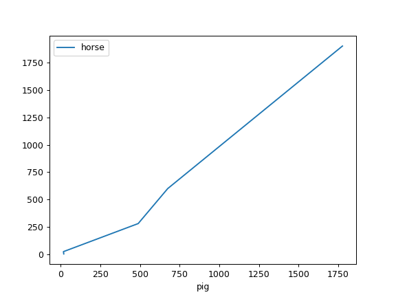
以下示例显示了两种种群之间的关系。
>>> lines = df.plot.line(x='pig', y='horse')