pandas.Series.plot.hist#
- Series.plot.hist(by=None, bins=10, **kwargs)[源代码]#
绘制 DataFrame 列的直方图。
直方图是数据的分布表示。此函数将 DataFrame 中所有给定 Series 的值分组到箱中,并在一个
matplotlib.axes.Axes中绘制所有箱。当 DataFrame 的 Series 处于相似的尺度时,这很有用。- Parameters:
- bystr 或序列,可选
用于分组的 DataFrame 中的列。
在 1.4.0 版本发生变更: 以前,by 被默默忽略,并且不进行任何分组
- binsint,默认 10
要使用的直方图箱的数量。
- **kwargs
附加关键字参数在
DataFrame.plot()中有详细说明。
- Returns:
- class:matplotlib.AxesSubplot
返回一个直方图。
参见
DataFrame.hist为 DataFrame 的每个 Series 绘制直方图。
Series.hist使用 Series 数据绘制直方图。
Examples
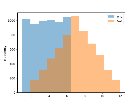
当我们掷骰子 6000 次时,我们期望每个数字出现大约 1000 次。但当我们掷两个骰子并将结果相加时,分布将完全不同。直方图说明了这些分布。
>>> df = pd.DataFrame(np.random.randint(1, 7, 6000), columns=['one'])
>>> df['two'] = df['one'] + np.random.randint(1, 7, 6000)
>>> ax = df.plot.hist(bins=12, alpha=0.5)
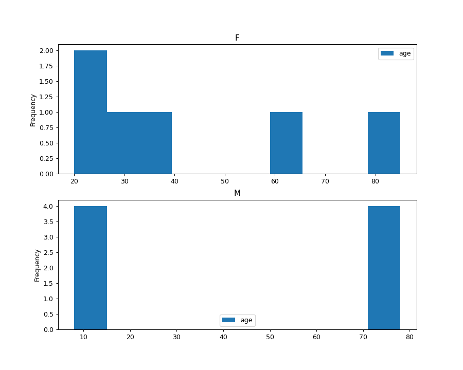
通过提供参数 by (可以是列名,也可以是列名列表) 可以生成分组直方图:
>>> age_list = [8, 10, 12, 14, 72, 74, 76, 78, 20, 25, 30, 35, 60, 85]
>>> df = pd.DataFrame({"gender": list("MMMMMMMMFFFFFF"), "age": age_list})
>>> ax = df.plot.hist(column=["age"], by="gender", figsize=(10, 8))