pandas.Series.plot.barh#
- Series.plot.barh(x=None, y=None, **kwargs)[源代码]#
绘制横向条形图。
横向条形图是一种图形,它以长度与所代表的值成比例的矩形条展示定量数据。条形图显示了离散类别之间的比较。图形的一个轴显示正在比较的特定类别,另一个轴表示测量值。
- Parameters:
- x标签或位置,可选。
允许将一列绘制到另一列。如果未指定,则使用 DataFrame 的索引。
- y标签或位置,可选。
允许将一列绘制到另一列。如果未指定,则使用所有数字列。
- colorstr, array-like, or dict, optional
DataFrame 列的颜色。可能的值包括:
- 按名称、RGB 或 RGBA 代码引用的单个颜色字符串,
例如 ‘red’ 或 ‘#a98d19’。
- 按名称、RGB 或 RGBA 引用的颜色字符串序列
代码,将依次递归用于每列。例如 [‘green’,’yellow’],每列的条形将依次填充为绿色或黄色。如果只有一列要绘制,则只使用颜色列表中的第一种颜色。
- 形式为 {列名颜色} 的字典,以便每列将
相应地着色。例如,如果您的列名为 a 和 b,则传递 {‘a’: ‘green’, ‘b’: ‘red’} 将使列 a 的条形着色为绿色,列 b 的条形着色为红色。
- **kwargs
附加关键字参数在
DataFrame.plot()中有详细说明。
- Returns:
- matplotlib.axes.Axes 或它们的 np.ndarray
当
subplots=True时,将返回一个 ndarray,其中每列有一个matplotlib.axes.Axes。
参见
DataFrame.plot.bar垂直条形图。
DataFrame.plot使用 matplotlib 绘制 DataFrame 的图形。
matplotlib.axes.Axes.bar使用 matplotlib 绘制垂直条形图。
Examples
基本示例
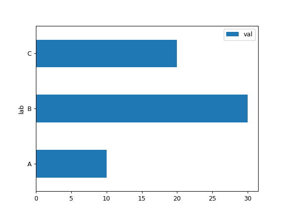
>>> df = pd.DataFrame({'lab': ['A', 'B', 'C'], 'val': [10, 30, 20]})
>>> ax = df.plot.barh(x='lab', y='val')
将整个 DataFrame 绘制为横向条形图
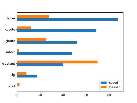
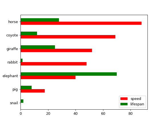
>>> speed = [0.1, 17.5, 40, 48, 52, 69, 88]
>>> lifespan = [2, 8, 70, 1.5, 25, 12, 28]
>>> index = ['snail', 'pig', 'elephant',
...          'rabbit', 'giraffe', 'coyote', 'horse']
>>> df = pd.DataFrame({'speed': speed,
...                    'lifespan': lifespan}, index=index)
>>> ax = df.plot.barh()
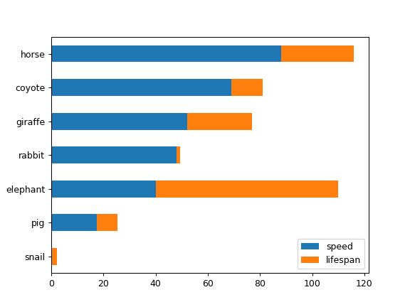
为 DataFrame 绘制堆叠的横向条形图
>>> ax = df.plot.barh(stacked=True)
我们可以为每列指定颜色
>>> ax = df.plot.barh(color={"speed": "red", "lifespan": "green"})
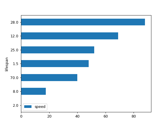
将 DataFrame 的一列绘制为横向条形图
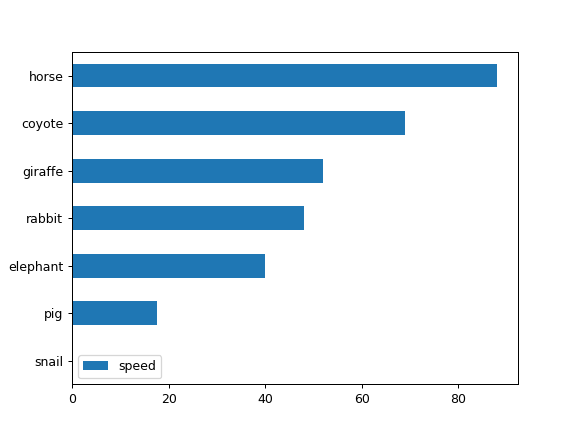
>>> speed = [0.1, 17.5, 40, 48, 52, 69, 88]
>>> lifespan = [2, 8, 70, 1.5, 25, 12, 28]
>>> index = ['snail', 'pig', 'elephant',
...          'rabbit', 'giraffe', 'coyote', 'horse']
>>> df = pd.DataFrame({'speed': speed,
...                    'lifespan': lifespan}, index=index)
>>> ax = df.plot.barh(y='speed')
将 DataFrame 与所需列进行绘制
>>> speed = [0.1, 17.5, 40, 48, 52, 69, 88]
>>> lifespan = [2, 8, 70, 1.5, 25, 12, 28]
>>> index = ['snail', 'pig', 'elephant',
...          'rabbit', 'giraffe', 'coyote', 'horse']
>>> df = pd.DataFrame({'speed': speed,
...                    'lifespan': lifespan}, index=index)
>>> ax = df.plot.barh(x='lifespan')